So I see on Bleeding Cool and ICV2 that Double Take is shutting down. Now I have nothing but respect for them. They made a great effort to get new books out. They had a low price and lots of support and enthusiasm. Everyone I talked to there did nothing but push their stuff hard. They made it easy for us to shelve, sent us lots of freebies to give away to get people interested. Appearances at retailer events like ComicsPRO and Diamond Summits. Gabe even came to the store. So I have nothing bad to say about their effort.
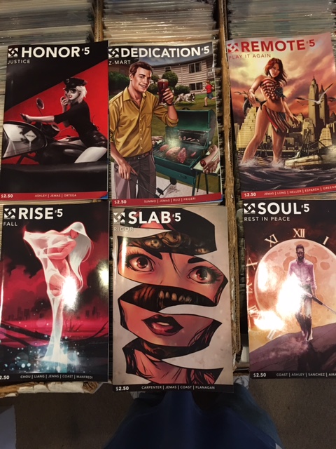
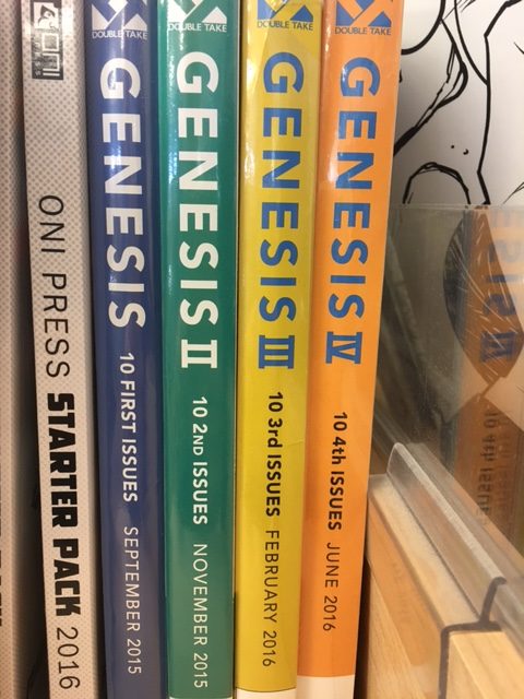
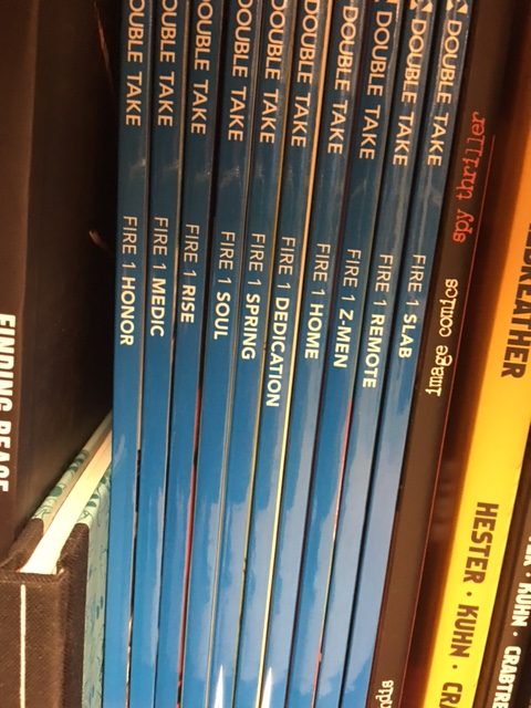
The problem with them lay in the execution. I carried all of their stuff. Not deep, but it’s all on the shelf. Here are pictures of their 3 products: Comics, Comic Bundles and Graphic Novel collections.
Note that there is nothing on the covers to indicate that these are part of a group or an larger story. Just very simple titles such as Rise, Home, Remote. I had no idea where to shelve these. Shelving them separately would have been confusing. But even if I shelve all 10 titles together, what do I put them under. The only Unifying thing is the Double Take logo.
Now the bundles of all 10 issues (neat idea) are labeled Genesis. OK. Not sure why.
But the trades are labelled Fire.
So, honestly, I don’t think either stores or readers knew what to make of these. I realize that they are based on Night of the Living Dead, but can’t use that name. But even something simple like Zombie Apocalypse or just Zombies! on the cover of each issue would have made it look more unified. As it is, books with names like Spring and Home make no sense on their own.
So, hopefully, this is a lesson to other publishers. Having a grand plan is great. 10 titles all working individually or on their own is a lot, but doable. But you need to brand it. Have it visually make sense. Make it easy for people to see how it fits together. Make it easy to understand. When stores can’t understand it, we can’t explain it to the customers. And this isn’t something with broad appeal that we could recommend to every one. It had a narrow audience to start with.
Let your books do the work. These did not carry the load. There was far too much other information needed to understand what was going on here.
So, to other publishers, creators, designers: Learn from this. When you are working on something for a long time, you can get too into it. You don’t see the big picture. Like with the DC Rebirth books and #1s. DC knew the difference between them. They wanted a Rebirth one-shot and then a nw series branded Rebirth. They got that part right. What they failed to see was how confusing having 2 consecutive issues that looked identical. Both said Batman Rebirth and #1. One had Rebirth above Batman, the other below. But to someone who does not know exactly what was going on, they looked virtually the same.
Ask for outside opinion. “Hey, how does this look?” There are lots of stores out there who would gladly chip in without giving away your secrets, just give advice. “This looks good, this could be confusing on a wall of 400 other books.”
Just trying to help.


